Data Visualization
Process and Methodology

The approach
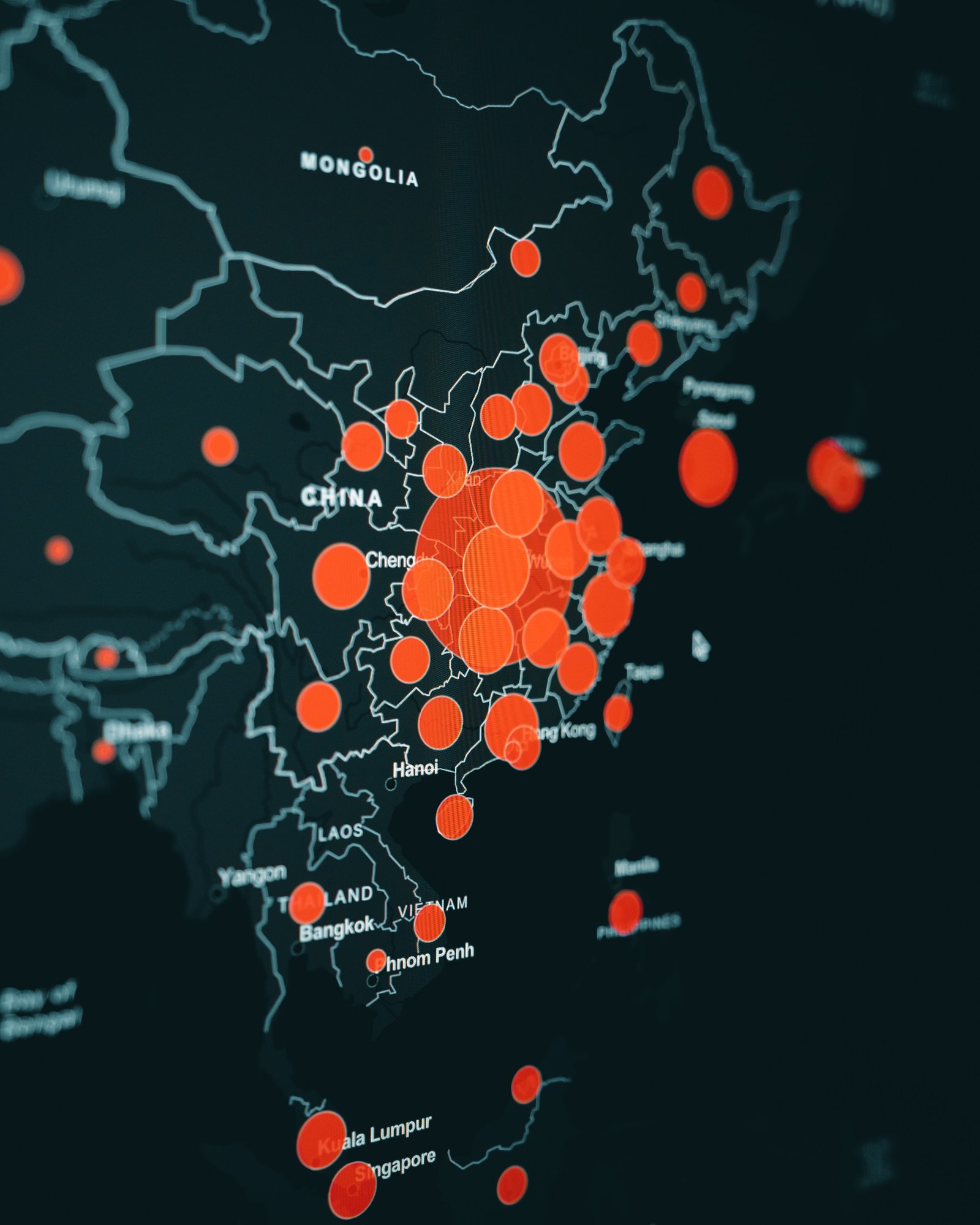
Data visualization is an essential part of data analysis that involves presenting data in a graphical or visual format. It enables businesses to gain insights from large and complex datasets by allowing them to identify patterns, trends, and correlations that may be difficult to spot in traditional tabular formats. At our company, we provide data visualization services that help our clients gain a better understanding of their data, make informed decisions, and communicate insights effectively.
Our team of data visualization experts utilizes cutting-edge tools and techniques to create custom visualizations that are tailored to our clients' needs. We work with a wide range of data types and sources, including structured and unstructured data, social media data, web analytics data, and more. Our goal is to deliver visually compelling and interactive visualizations that enable our clients to explore and understand their data intuitively.
Whether you're looking to create dashboards, infographics, reports, or interactive visualizations, we have the expertise to help you. We work closely with our clients throughout the data visualization process, from data preparation to design and development, to ensure that the final product meets their expectations and requirements. Contact us today to learn more about our data visualization services and how we can help you gain insights from your data.
guidance
Navigating a strategic roadmap
Define Your Goals
Before beginning your data visualization project, it is important to have a clear understanding of your goals. What questions do you want to answer? What insights are you hoping to gain? What key performance indicators (KPIs) do you need to track? This will help you determine what data you need to collect and analyze, as well as what type of visualization will be most effective in conveying the insights you uncover.
Collect and Cleanse Data
The next step in data visualization is to collect and cleanse your data. This involves identifying the relevant data sources, collecting the data, and cleaning it to ensure accuracy and consistency. Data cleansing includes tasks such as removing duplicates, correcting misspellings, and formatting data to ensure it is consistent across all sources
Choose Your Visualization Type
With your goals and data in hand, you can now choose the type of visualization that will best serve your needs. Common types of data visualizations include line charts, bar charts, scatter plots, heat maps, and geographic maps. Your choice will depend on the nature of your data, the insights you hope to gain, and the audience you are trying to reach.
Design Your Visualization
Once you have chosen your visualization type, it's time to design your visualization. This involves selecting the right colors, fonts, and labels to ensure your visualization is clear and easy to understand. You also want to consider the layout of your visualization and how it will be presented to your audience.
Test and Refine Your Visualization
Before sharing your visualization with your intended audience, it is important to test it and refine it as needed. This includes testing your visualization with a small group of users to get feedback on its effectiveness and making any necessary changes based on that feedback.
Share Your Visualization
The final step in data visualization is to share your insights with your intended audience. This can be done through a variety of channels, including email, social media, or your website. You may also want to consider creating a dashboard or interactive visualization that allows your audience to explore the data on their own.
